Branding
Creative Brief – Creative Therapy Services
Create a logo and business card for a child therapy service that visits schools in the north Missouri’s school districts. They wanted something that was fun and represented children without it feeling elementary, cheesey, or the children blocks. Maybe try to incorporate something about hte senses within the design.
Creative Therapy Services had already provided a Pinterest moodboard as part of their assets.


Digital Sketches
When sketching began, I wanted to focus on the senses and stay away from the tradiontional child’s branding colors and feel. Softer colors and vibrant secondary colors felt like a great place to start.
Digitally sketched for the Creative Therapy Services logo project, creating the icon in Procreate and pairing it with type in Illustrator.


Roughs (Round 1)
Provided the client with two choices, A and B, since they are both very differen from one another it would allow us to narrow down what the client likesd
A new problem arose and the client was estactic with both choices, with very little edits.

Roughs (Round 2)
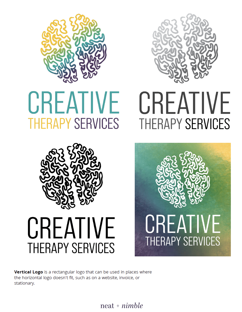
After completing the client and internal edits from the round 1 roughs, the choices had funneled further to two completed looks. The deciding factor was the typeface to see which the client would choose. All the versions of the logo were laid out to demonstrate how they would appear with different backgrounds and the visual effects this way we could write the rules in the idenity guide.

Final (Created Logo Files/Identity Guide)
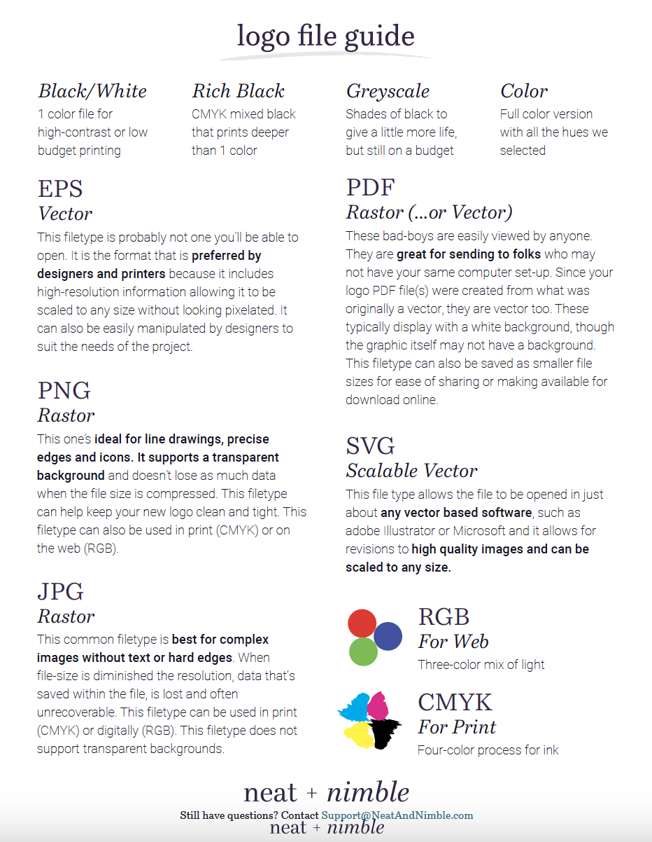
The client choose A from round 2 roughs, this was a personal win, because I loved it myself. The process to create the logo files begins in a new Illustrator file, were I made the logos 2500px wide each, this was a standard at neat + nimble. Next, all of the versions, primary logo, one color, and reverse, were exported out in five file types, PDF, JPG, SVG, EPS, and PNG. Then organized into their own folder by type and color.
Lastly, the logo and rules were plugged into the idenity guide template, along with the colors, typefaces, and assets.
Idenitity Guide


Minutiae Cleaning & Petcare
A passion project developed for my stepmother to maybe one day make her love for cleaning and pets a business. The design was inspired by her favorite flower, the oriental lilly, and she chose the name Minutiae for the meaning of precise detail.
Logos


Business Cards


Business Cards – neat + nimble
Designed for clients at neat + nimble. Each began with sketches of a general layout, then the neat + nimble standard of 2-3 roughs was created. After a few revisions, the pressready version was created.
All the business cards here were developed and finalized in InDesign, but a few graphics, such as the Venneman logo were created in Illustrator.